Tuesday, February 28, 2012

Sunday, February 12, 2012
Tuesday, April 19, 2011
DMA234: Final Project Part 3
See Part 1
See Part 2
7. Inspiration


8. Elements used
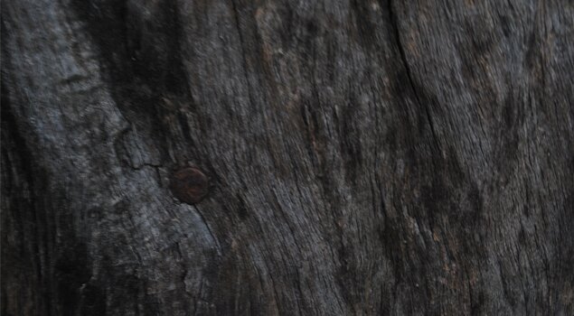
For one of the elements I wanted to use fire for sure. Thankfully, I had a fire texture photo laying around from posting textures earlier this semester. It shows off the fierceness of the dragon on the skateboard and really emphasizes the idea of dragons and fire.
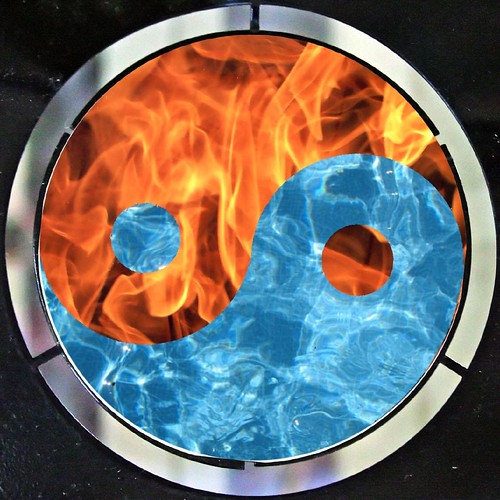
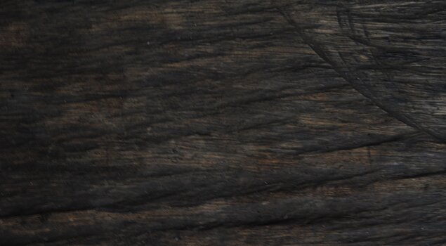
 For another element, I really wanted to use water to play ying and yang. But unfortunately, I could not find a good enough or large enough photo of water so I made use of what I have. I inverted the colours of the fire photo that I had and it actually looked pretty good. It looked like splashing water, or as if a glass of water suddenly shattered, it looks pretty good.

9. Final Product

This is the final poster for the skateboard poster project. I decided to use this layout for it's simplicity and because it gets across the idea I wanted. I chose the copy "Flip the Script" because it applies to skateboards and it shows the attitude of the brand. "Brave the Elements" shows the strength and quality of the product and as well speaks upon the fire and water elements being implied by the poster and skate deck. The company logo is featured dead center on the product shot so it was not necessary to show it again.
For the full size .jpg, please click on this link:
Full Size
It is also available in 2 different wallpaper sizes as well:
1600 x 900
1024 x 768
It has been a pleasure covering the entire skateboard poster process with you, the viewers! If you would like to see anything else with this project, please let me know.
See Part 2
7. Inspiration


8. Elements used
For one of the elements I wanted to use fire for sure. Thankfully, I had a fire texture photo laying around from posting textures earlier this semester. It shows off the fierceness of the dragon on the skateboard and really emphasizes the idea of dragons and fire.
 For another element, I really wanted to use water to play ying and yang. But unfortunately, I could not find a good enough or large enough photo of water so I made use of what I have. I inverted the colours of the fire photo that I had and it actually looked pretty good. It looked like splashing water, or as if a glass of water suddenly shattered, it looks pretty good.
9. Final Product

This is the final poster for the skateboard poster project. I decided to use this layout for it's simplicity and because it gets across the idea I wanted. I chose the copy "Flip the Script" because it applies to skateboards and it shows the attitude of the brand. "Brave the Elements" shows the strength and quality of the product and as well speaks upon the fire and water elements being implied by the poster and skate deck. The company logo is featured dead center on the product shot so it was not necessary to show it again.
For the full size .jpg, please click on this link:
Full Size
It is also available in 2 different wallpaper sizes as well:
1600 x 900
1024 x 768
It has been a pleasure covering the entire skateboard poster process with you, the viewers! If you would like to see anything else with this project, please let me know.


Sunday, April 17, 2011
DMA234: Halle Barry and Celebrity Couple
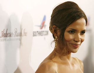
For this assignment we had to use multiple types of photoshop mixture brushes (dry, wet, moist, etc) and apply them to a picture of Halle Barry. This is what I did to her photo.
Before: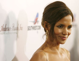
After:
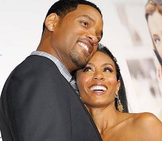
And furthermore, we have to apply the same effect to a photo of any celebrity couple. This is the effect applied to Will Smith and his wife.
Before:
After:

Before:

After:

And furthermore, we have to apply the same effect to a photo of any celebrity couple. This is the effect applied to Will Smith and his wife.
Before:

After:



Subscribe to:
Posts (Atom)