Tuesday, April 19, 2011

DMA234: Final Project Part 3

See Part 1

See Part 2

7. Inspiration


8. Elements used

For one of the elements I wanted to use fire for sure. Thankfully, I had a fire texture photo laying around from posting textures earlier this semester. It shows off the fierceness of the dragon on the skateboard and really emphasizes the idea of dragons and fire.


For another element, I really wanted to use water to play ying and yang. But unfortunately, I could not find a good enough or large enough photo of water so I made use of what I have. I inverted the colours of the fire photo that I had and it actually looked pretty good. It looked like splashing water, or as if a glass of water suddenly shattered, it looks pretty good.


9. Final Product


This is the final poster for the skateboard poster project. I decided to use this layout for it's simplicity and because it gets across the idea I wanted. I chose the copy "Flip the Script" because it applies to skateboards and it shows the attitude of the brand. "Brave the Elements" shows the strength and quality of the product and as well speaks upon the fire and water elements being implied by the poster and skate deck. The company logo is featured dead center on the product shot so it was not necessary to show it again.

For the full size .jpg, please click on this link:

Full Size

It is also available in 2 different wallpaper sizes as well:

1600 x 900

1024 x 768

It has been a pleasure covering the entire skateboard poster process with you, the viewers! If you would like to see anything else with this project, please let me know.

DMA233: Our Solar System Poster

DMA233: Album Booklet


Sunday, April 17, 2011

DMA234: Halle Barry and Celebrity Couple

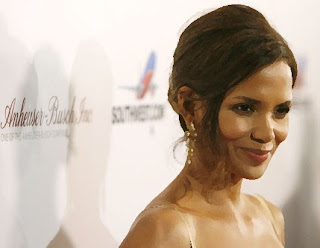
For this assignment we had to use multiple types of photoshop mixture brushes (dry, wet, moist, etc) and apply them to a picture of Halle Barry. This is what I did to her photo.

Before:

After:


And furthermore, we have to apply the same effect to a photo of any celebrity couple. This is the effect applied to Will Smith and his wife.

Before:


After:

DMA234: Textures 40-42 Final week


Wednesday, April 13, 2011

DMA234: Final Project Part 2

See Part 1

4. Guidelines

Fonts: Vani (On the skatedeck), Onyx (On poster)

Skate Deck Element: See Part 1

Colour scheme: Blue and Red on White.

Legal Copy: All Rights Reserved. 2011. © Kevin Duong.

Size: 24" x 18" @ 300DPI

Orientation: Portrait

5. Sketches

These were a couple quick sketches I did just to get the overall layout of the poster laid out and just to give me an idea of how much space I had to work with.


6. Concept

For this poster, I wanted to get across the idea of elements in relation to the dragons on the skate deck. I really want the poster to emphasize the skateboard design and really bring it to life. Kind of like the ying and yang, I want the polar opposites of the dragons to be emphasized in the design, like fire vs. water.

Stay tuned for the final board design.

Thursday, April 7, 2011

DMA234: Final Project Part 1

1. Assets


This is the picture of the skateboard that will be used for this project. It is the same skateboard from the first semester. We originally supposed to start our own brand of skateboard so I created the brand "Levitation" and a logo to go with it, featured on the back of the board. On the board there are two dragons, one of a blue colour and the other of a red colour. Dragons are shown as strong mythical creatures and the fact that they can fly works in conjunction with the brand name. The definition of "Levitation" is "defying gravity", which is something that skaters feel they're doing when they're skateboarding, going off jumps. So with that, the tagline created for the brand is "Defying rules, defying gravity", which are two things that skaters can relate to.


2. Planning/Conceptualization


The brand identity is that Levitation skateboards are premium skate decks that represent style, quality and innovation. We would want that to be shown through every media and every angle of the brand, from the board right down to the promotion of it. This is a little brain storming that was done with association with the brand, what it stands for and the consumers. In order to build a strong connection with the consumers and really get them to live and breathe the brand, we must first study their behaviour and cater to them accordingly.

3. Storyline

It is said that dragons are the most fearsome and powerful creatures ever. They have the ability to breathe balls of fire and fly effortlessly through the air at blistering speeds. Through-out their history, dragons have somehow been tamed by humans, despite being much stronger than humans. Of course that is all mythical, and humans can only hope to be as fierce as dragons are. We can't possible tame dragons. But, it is believed in ancient culture that tattooing a dragon on your body would help bring you strength and confidence. So that is exactly what we have done. The Levitation skate deck is infused with two tribal dragon tattoos, one a dragon of water and the other is a dragon of fire, to give the user determination and strength. In addition, the user possesses the same intimidation traits as a dragon would with their tough exterior appearance.


Stay tuned for more with this project.

Friday, March 18, 2011

DMA234: Hai Menu Project

The Project:
A new far-east fusion restaurant plans to open a new location in the Entertainment district and requires a new menu design. You have been tasked with creative for this project

- Using the soya sauce painting asset as source you will provide a prototype concept of the menu layout using the clients art direction. You must highlight the use of real hand-made art assets as the raw starting point of the digital assets you must create for this engagement.

- Menu items and other information will be provided via client copydeck.
- final image display will be a series of jpg formated images of all menu pages.
Details will only be provided during class all hands meetings
- A complete PDF will also be required

Process and development must be posted via student production blog it must show the lifecycle of the design process ruff sketch, blocking, assets. Grade will be based on milestones and will follow the same general process elements.


The Soy Sauce Menu:


This is the soy sauce background that I created last semester. We are using this painting and using elements to create a restaurant menu. It is supposed to be a cherry blossom tree with some stylized splashes and blossoms through-out.


The Mind Map:


The Mind Map helped me determine what kind of restaurant this would be and what traits the brand would carry. Those same traits would then be shown in the menu so that the customers know exactly what the restaurant is about just by looking at the menu.


Layout Sketches:
These are some of the many layout sketches that were drawn. The final menu was closest to this design, using a booklet concept. I thought using a simple 'open-up' booklet would work well as a restaurant menu. It's simple and all of the items are in sight at once. It works better than a brochure type so that the customer does not have to flip back and forth between the menu.


Time Sheet:
This is the time sheet used to log the work hours for this project.


The Cover:

This is the cover of the menu, which has the logo and the soy sauce painting elements all in it. I wanted to create something abstract and eye-catching. I took pieces of the cherry blossom tree and overlapped them on top of each other to create a rather interesting effect.


Menu Page 1:
This is the first page of the 2 page spread menu. I used a colour change effect on the background to create coloured splashes using the soy sauce painting. I wanted the menu to be very uniform, very simple and easy to read. There are no pictures on the menu to create a sort of sophistication with the restaurant (like many other top restaurants). All of the menu items are shown in black so that is easier to read. The logo is shown at the bottom right and the legal is shown at the bottom as well.


Menu Page 2:
The second page of the menu follows the same layout. The background colours are changed to differentiate between this and the other page. Aside from the colours and the menu items, the page remains relatively the same.


Colour Swatches:

These are the colours and font used for this project.

PDF LINK: http://kevinduong.ca/dma/KevinDuongHaiMenu.pdf

Tuesday, March 15, 2011

DMA234: Hai Menu Inspiration

The Art Direction for the menu is as follows: "The great artist Shigeo Fukuda bold and unique poster design is the cornerstone of Hai restaurant art direction and at many level the culture of walking in the door. Elements of WW2 propaganda poster design should also add lightweight influences for the design style. "


After going through a few articles and a bunch of work, the style of the artist uses a lot of repeating elements. He uses many elements to create optical illusions. The use of colour, patterns and lines is very intricate and eye-catching.